Your Headers Are Lying to Google
I ran an audit last month where a B2B company had seven H1 tags on their homepage. Seven different elements, all marked as the most important heading on the page.
Google doesn’t know which one to trust. Screen readers don’t know how to build a logical outline. The site owner thought they were emphasizing important content. They were actually creating confusion for both search engines and users.
This happens constantly. Headers and meta descriptions are doing double duty. They organize content for both search engines and assistive technology users. When you get them wrong, you’re losing rankings and accessibility at the same time.
Why Headers Matter (And It’s Not About Font Size)
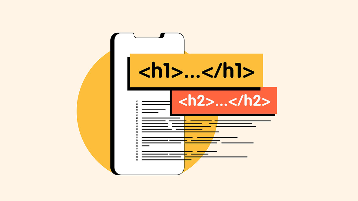
Headers aren’t styling tools. They’re structural elements that define the hierarchy and organization of your content.
For search engines, headers signal what your page is about and how information is organized. Google uses H1 tags to understand the main topic, H2 tags for major sections, and H3-H6 tags for subsections. This helps determine relevance for search queries and which content deserves prominent placement in results.
For screen reader users, headers are navigation tools. They jump between headings to understand page structure and find specific sections. A properly marked H2 tells them “this is a new major section.” An H3 under that H2 means “this is a subtopic of the section above.” They build a mental outline of your page based on heading levels.
When you misuse headers, whether by having multiple H1s or by using header tags just to make text bigger, you break both systems. Google can’t determine your content hierarchy. Screen reader users can’t navigate your page. You’re paying the cost twice.
The Multiple H1 Problem
Here’s the most common mistake: multiple H1 tags on a single page.
The logic seems reasonable. You have several important pieces of content. You want to emphasize them all. So you mark them all as H1s. You’ve now told Google and screen readers that your page has multiple “most important topics.” Neither knows which one is actually the primary focus.
HTML5 technically allows multiple H1s if they’re in separate sectioning elements, like article or section tags. But search engines and assistive technology don’t consistently support that approach. The safest, most universally understood pattern is one H1 per page that describes the main topic, followed by a logical H2-H6 hierarchy.
One common question: Can you go from H4 back to H2? Yes. Header hierarchy works like an outline. You can’t skip levels going down (H1 directly to H3 with no H2), but you can move back up to start a new section. H1 > H2 > H3 > H4 > H2 > H3 > H4 is perfectly valid. The H2 after the H4 simply starts a new major section at the same level as the earlier H2.
Important: do NOT go back up to H1. You should only have one H1 per page. Going from H3 back to H2 is fine. Going from H4 back to H2 is fine. But never use a second H1. That creates the multiple H1 problem we just discussed.
Think of it like a book structure. You can have Chapter 1 > Section 1.1 > Subsection 1.1.1, then start Chapter 2 > Section 2.1. You’re moving from a deep subsection back to a new chapter. That’s exactly how header levels work. But you wouldn’t have two book titles.
If you need emphasis without semantic weight, use other styling. Bold text, larger font sizes, different colors. These create visual hierarchy without confusing the underlying structure. There’s a difference between emphasis and semantic importance. Visual prominence doesn’t require header tags.
Headers Used for Styling Instead of Structure
The second most common issue: using headers because they’re big and bold, not because they represent structural hierarchy.
Someone wants a callout box with prominent text. They use an H3 because it’s the right visual size. But that H3 has nothing to do with the page structure. It’s just decoration. Now your outline is broken. Screen readers announce a new section where none exists. Search engines think this decorative text is structurally significant.
The solution isn’t complicated. Style regular paragraphs or spans to look however you want. Use CSS to control font size, weight, color, and spacing. Reserve header tags for actual structural hierarchy.
If you need to add emphasis to text while maintaining accessibility, there are proper ways to do it. Strong tags, em tags, and CSS styling all work. What doesn’t work is using headers as a shortcut to make text bigger.
The Keyword Stuffing Trap
Headers aren’t the only elements doing double duty for SEO and accessibility. Meta descriptions and title tags face the same challenge. They’re meant to accurately describe page content for both search engines and users. Instead, they often become keyword dumping grounds.
A proper title tag clearly states what the page is about. “Industrial Valve Solutions for Manufacturing” works. “Industrial Valves Manufacturing Valve Solutions Valve Suppliers Industrial Manufacturing Valves” does not. The second version is trying to rank for every possible variation. It reads like spam and doesn’t help anyone.
The same applies to meta descriptions. They should provide context and value, not jam in every keyword variation you can think of. Search engines are sophisticated enough to understand synonyms and related concepts. Users are smart enough to recognize keyword stuffing when they see it.
Context matters more than density. A meta description that accurately describes your content, using natural language, performs better than one optimized for keyword frequency. Google understands semantic relationships. It knows “industrial valve manufacturer” and “factory valve supplier” refer to similar concepts. You don’t need to include both, especially not in ways that make sentences unreadable.
What Automated Tools Miss
This is where manual testing becomes critical. Automated accessibility scanners and SEO tools check for the presence of headers. They verify that H1 tags exist. They confirm meta descriptions are the right length. They don’t check if headers make sense.
A site can pass automated testing while having completely illogical header structure. Headers might be present but out of sequence. H1, then H4, then H2. Or headers might exist but describe the wrong content. Or multiple H1s might be present, which some tools flag as a warning but don’t enforce as an error.
Automated SEO tools are similar. They check keyword presence in headers. They measure meta description length. They don’t evaluate whether those headers and descriptions accurately represent the content. A meta description can hit all the technical checkboxes while being stuffed with keywords, making it unreadable.
Manual review catches these issues. You can see when headers jump from H2 to H5 with no H3 or H4 in between. You can identify when an H1 doesn’t match the actual page topic. You can spot keyword-stuffed meta descriptions that technically pass validation but fail usability.
This is the gap between compliance and quality. Automated tools verify presence and format. Humans verify meaning and structure.
How to Audit Your Own Headers
Pull up your homepage and view the source code. Look for H1 tags. If you have more than one, you have a problem. If your H1 doesn’t accurately describe the page topic, you have a problem.
Then trace through the rest of your headers. Do they follow a logical sequence? Is there an H2 after your H1? Do H3s appear under relevant H2s? Or do header levels jump around randomly?
Next, look at your meta descriptions and title tags. Do they describe the actual content? Are they written in natural language? Or are they keyword lists disguised as sentences?
For deeper validation, use a screen reader. NVDA is free for Windows. VoiceOver is built into macOS. Navigate your site using only headings. Does the structure make sense? Can you jump between sections logically? Or does the heading navigation feel random and disorganized?
Compare that experience to what you see in Google Search Console. Are the pages you think are important getting impressions for the right queries? If your H1 says “Industrial Valve Solutions” but you’re getting traffic for “hydraulic pumps,” your headers might be misleading search engines about your actual content.
Quick Wins
Start with duplicate H1 removal. One H1 per page, describing the primary topic. Everything else should be H2-H6 in logical hierarchy. This is the fastest fix with the biggest combined impact on SEO and accessibility.
Second, stop using headers for styling. If you need bigger text, use CSS. If you need emphasis, use strong or em tags. Reserve headers for structural organization.
Third, rewrite keyword-stuffed meta descriptions. Describe the content accurately in natural language. You’ll rank better and get better click-through rates from search results.
Finally, test keyboard navigation. If you can’t tab through your entire site logically, headers probably aren’t your only problem. But fixing header structure is often the easiest starting point for broader accessibility improvements.
Headers are doing two jobs at once. When you get them right, you improve search visibility and accessibility simultaneously. When you get them wrong, you’re losing rankings and losing users for the same reasons.
Your headers should tell the truth about your content structure. Not the truth you want Google to believe, not the visual hierarchy you prefer. The actual organizational structure of your information. When headers match reality, everything else gets easier.
Sources:
- Florida International University: “How to Add Emphasis to Your Text with Accessibility in Mind” – https://core.fiu.edu/blog/2024/how-to-add-emphasis-to-your-text-with-accessibility-in-mind.html
- Tenet: “SEO Mistakes to Avoid” – https://www.wearetenet.com/blog/seo-mistakes-to-avoid (Note: External agency source, buyer beware)
- WebAIM: “The WebAIM Million – 2025 Report” – https://webaim.org/projects/million/