What do I do when my web designer won’t listen to me?
I know there are many reasons to stop on this post and try to figure out the nuances of why people won’t listen to you, but this is a specific story about when I was caught in between a rock and a hard place with a designer that just refused to listen to my warnings about web accessibility.
There’s a reason that I’m passionate about accessibility, it comes down to personal experiences, of which I have many. One such experience is that I’m colorblind and I can’t tell the difference between most blues and purples. I didn’t know I was colorblind until my mid-30s, even though my mom says she knew since I was about five (gee, thanks mom).
A few years ago, I was working with a designer on a website project. They wanted a specific interactive element to be purple on a blue background. The problem was that I couldn’t see it. At all.
I told them, “Is there supposed to be something here? It seems like there is, because this section is just too blue.”
They didn’t believe me. “It’s clearly visible. The purple in the middle stands out perfectly.”
Well, not to me it didn’t. Not to a portion of the 8% of men who are colorblind that share similar color vision deficiencies as I do.
The designer won. The purple element stayed, and I still couldn’t use the site. And that my friends, is what happens when designers don’t listen to accessibility feedback. You don’t create compliance problems; you create sites that real people can’t use.
The Pattern
Sadly, I’ve seen this pattern more than once. You tell a designer something isn’t accessible. They push back. Here’s what I’ve heard:
“It looks fine to me.”
“Nobody else has complained.”
“That would ruin the aesthetic.”
“We can add a note for people with disabilities.”
This misses the point entirely. Accessibility isn’t about what looks good to people without disabilities. It’s about whether everyone can actually use what you built.
That designer on the purple-blue element project wasn’t being malicious, but he sure wasn’t using the technology available or advice given by someone with a disability. They genuinely believed the purple was visible enough, because they could see it.
Now, some people just dismiss colorblindness as a disability. And unfortunately, I can see why.
AJ (SANscript’s CEO) is legally blind. She uses screen readers. Most people understand that. But I can see the screen, I just can’t differentiate certain colors. Purples and blues, navy blue and black, pinks and grays are all culprits too.
So when I’m staring at what looks like a solid blue background and the designer sees a purple interactive element. I don’t get the same experience as someone else. And that is an accessibility error that the designer could easily remedy with a tool like Colour Contrast Analyzer.
The Numbers Don’t Lie
If you’re ever in this situation, just remember this: the numbers don’t lie. Case in point:
1. Show them the data: “8% of men are colorblind. That’s millions of potential customers who can’t use what you designed.”
2. Use contrast checking tools like the aforementioned Colour Contrast Analyzer or use WebAIM’s contrast checker. If it fails WCAG standards, it fails. Period.
3. Explain to them the cost of a lawsuit if someone were to not find that important information on your site. And just think, you could have avoided $XX,XXX in legal fees and the time it took to even think about it after doing it right the first time.
The problem comes down to that you can’t fix accessibility if the people building your site don’t believe it’s a real problem.
It isn’t design criticism, it’s doing the right thing!
That said, I get why designers resist accessibility feedback.
Design is visual. You spend hours perfecting color palettes. If someone tells you “that purple doesn’t work,” it feels like they’re criticizing your taste. But accessibility isn’t about taste. It’s about function.
That purple might be the perfect shade from a branding perspective. It might test beautifully with your focus group. But if colorblind users can’t see it, it doesn’t matter.
The best designers I’ve worked with treat accessibility constraints like any other design constraint. You wouldn’t design a button that’s too small to click. You wouldn’t use a six point font. You wouldn’t put white text on a white background.
The right discussion
Here’s what should have happened with that purple-on-blue element:
Me: “I can’t see this. It’s purple on blue, and I’m colorblind.”
Designer: “Let me check the contrast ratio. [checks] You’re right, it’s 2.8:1. WCAG requires 4.5:1 for text and 3:1 for interactive elements. What if we darken the purple or add a border?”
We test both. The darker purple works. Problem solved.
Total time: 5 minutes.
Instead, we spent multiple sessions bringing up the issue and whether the purple was “visible enough.” Good designers don’t debate whether your disability is real.
Ultimately accessibility should win out
This whole experience taught me that you can’t assume designers understand accessibility just because they’re good at design. Some do, but many don’t.
If you’re working with a designer and they dismiss your accessibility feedback, it’s not because they’re bad people. It’s usually because they’ve never had to think about it before.
Your job as someone who wants an experience that is accessible to all is to make them think about it now.
And if they still won’t listen? Find someone who will.
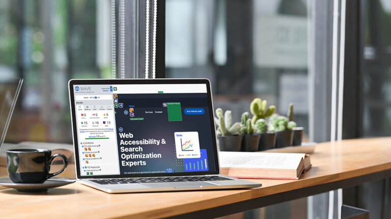
Not sure if your site has accessibility issues your designer might be missing? Our free website audit includes manual testing for issues automated tools miss, including color contrast problems that affect colorblind users like me.