When Good Design Becomes Bad Accessibility
Your website looks incredible. The animations are smooth. The mega menu expands beautifully. The hero section has that parallax effect everyone’s doing.
And 25% of your potential customers can’t use it.
This isn’t about ugly websites being inaccessible. The opposite problem is more common: websites designed to win awards instead of serving users. Sites that prioritize aesthetics over function hurt everyone. Not just people using assistive technology, but also people with motor control limitations and low vision users who navigate visually.
The Low Vision Navigation Nightmare
Here’s the scenario most people miss: someone with low vision trying to navigate your site. They might use a screen reader for some tasks and visual navigation for others, or use both simultaneously. They can see the screen, just not well enough to rely on vision alone. They might use browser zoom, they might lean closer to the monitor, they might need reading glasses. They’re navigating with whatever combination of tools and methods works for them.
Except your keyboard navigation is broken. According to WebAIM’s 2024 Screen Reader User Survey, lack of keyboard accessibility remains one of the most problematic issues on the web, a problem that has persisted largely unchanged for the past 14 years.
Now they’re stuck. They can’t navigate efficiently with keyboard shortcuts because Tab doesn’t focus elements properly or Enter doesn’t activate links. They can’t rely fully on visual cues because their vision is limited. So they end up trying to use the mouse to navigate visually, hunting for interface elements they can barely see, while dealing with hypersensitive interactions designed for people with full vision and precise motor control.
This is where design that prioritizes aesthetics creates real barriers. Every hypersensitive hover state, every menu that appears uninvited, every animation that shifts content. These aren’t just annoyances. They’re obstacles for people navigating with limited vision and broken accessibility features.
The Oversensitive Menu Problem
The most frequent complaint I hear about B2B websites? “The menu keeps popping up when I don’t want it to.”
You’ve experienced this. You’re scrolling down a page, your cursor drifts near the navigation, and suddenly a massive menu deploys across your screen, covering the content you were reading. You move your mouse to close it, and it disappears. But then you accidentally trigger it again, trying to scroll.
Now imagine you have a tremor. Or Parkinson’s. Or limited fine motor control. Hypersensitive hover states require precise cursor positioning. When menus appear and disappear based on pixel-perfect mouse placement, you’re creating barriers for anyone whose hands shake or whose motor control isn’t precise.
I’ve watched someone with low vision try to use one of these menus. They hover over a menu item, it expands. They move their cursor toward a submenu option they can barely see, and the entire thing collapses because the hover detection is set to hair-trigger sensitivity. They’re trying to navigate visually (because the keyboard navigation doesn’t work), but the design assumes full vision and precise motor control.
Mega menus aren’t inherently bad. They can be excellent for sites with complex information architecture. They must be designed with actual use cases in mind. That means reasonable hover delays, full keyboard support that actually works, and keeping critical pages within two clicks maximum. If someone has to navigate through three or four expanding submenus to find basic information, that’s not just poor design. That’s a cognitive load nightmare for everyone, and a complete barrier for anyone with limited vision trying to parse a complex menu tree they can barely see.
Animations: When Motion Helps and When It Hurts
Animations aren’t inherently bad. They provide valuable feedback. Loading states show progress, form submissions confirm success, transitions guide attention to important changes. The problem is animations that ignore user needs and preferences.
Some users have vestibular disorders triggered by motion. Others have cognitive processing limitations where shifting content makes comprehension harder. Many people simply find constant movement distracting. Operating systems and browsers provide a setting for this: prefers-reduced-motion. Users who need less animation can enable it. Accessible sites respect that preference.
Here’s where to find this setting:
- Windows 10: Settings > Ease of Access > Display > Show animations in Windows
- Windows 11: Settings > Accessibility > Visual Effects > Animation Effects
- macOS: System Settings > Accessibility > Display > Reduce motion
- iOS: Settings > Accessibility > Motion > Reduce Motion
- Android 9+: Settings > Accessibility > Remove animations
The technical implementation is straightforward. Responsible sites include CSS like this:
@media (prefers-reduced-motion: reduce) {
{ animation-duration: 0.01ms !important; transition-duration: 0.01ms !important; } }
When someone enables reduced motion in their settings, animations effectively disappear. The functionality remains. Elements still appear and disappear, forms still submit, content still loads. But without the motion that causes problems.
Animations that slide elements over important content create specific issues. For someone with low vision, tracking content they can barely see is disorienting. They’re trying to find specific information, visually following text, and suddenly everything moves. They lose their place. They have to reorient themselves to figure out where their content went.
The test: turn off animations in your browser settings and reload your site. Does critical functionality break? Do elements become invisible? If your site requires animations to work, you’ve made motion mandatory for users who can’t tolerate it. Animations should enhance, not enable.
Vision impairment exists on a spectrum. Plenty of your customers have visual limitations but don’t use screen readers. They need reading glasses. They use browser zoom. They struggle with low contrast. They’ve enabled reduced motion settings because movement makes content harder to track. Your animated interface, which ignores their preferences, makes their experience worse.
Notification Banners: When Dynamic Content Works (And When It Doesn’t)
Notification banners are actually valuable for time-sensitive information. Emergency closures, changing hours, security alerts. These need to reach users immediately. The problem isn’t using banners. It’s implementing them without considering how screen readers and keyboard users interact with dynamic content.
A poorly implemented banner pushes navigation down the page without announcing itself. Screen reader users don’t know that new content has appeared. They’re navigating based on the page structure they initially encountered, but that structure just shifted. They’ve lost their reference point.
The solution is ARIA live regions:
<div role=”alert” aria-live=”assertive”> Store closing early today at 3 PM due to weather </div>
With proper ARIA markup, screen readers announce new content when it appears. The user hears the alert without losing their place on the page. aria-live=”assertive” interrupts immediately for urgent announcements. aria-live=”polite” waits for a natural pause for less critical updates.
But even properly announced banners need dismissible controls. A banner that covers navigation without a keyboard-accessible close button traps keyboard users. They can’t dismiss it, can’t navigate past it, and can’t access the content it’s covering. The close button needs proper focus management—it should be reachable with the Tab key, activated with Enter or Space, and, when dismissed, return focus to a logical position on the page.
The difference between good and bad implementation isn’t whether you use banners. It’s whether they’re announced to screen readers, dismissible by keyboard, and functional without requiring vision or mouse control.
The Clean Design Paradox
Minimalist, clean designs tend to work better for accessibility. Not always, but often. When you strip away the decorative elements and focus on clarity, you usually end up with something more usable.
The problem is when “clean” becomes “hiding everything behind layers of interaction.” Content hidden in accordions that require interaction to reveal. Critical information buried three clicks deep because it would clutter the pristine homepage. Hamburger menus on desktop sites with plenty of screen space.
That last one deserves attention. On mobile, hamburger menus are necessary and expected. Screen size requires collapsing navigation. The accessibility challenge isn’t whether to use them. It’s implementing them properly. The menu button needs a proper label like: <button aria-label=”Open navigation menu”>. Focus should move into the menu when it opens. Escape key should close it. Focus should return to the menu button when closed. The icon itself needs to be large enough (48×48 pixels minimum) and have high enough contrast to be found.
For someone with low vision on mobile, the hamburger icon still presents challenges. It’s small. It might blend into the header. But there’s no real alternative given screen constraints. The solution is making it as discoverable as possible, large touch target, high contrast, consistent placement.
On desktop, hamburger menus are a different question. Why hide navigation when you have space to display it? Forcing users to click an icon to reveal navigation that could be visible creates unnecessary friction. It’s not technically inaccessible if implemented properly. Keyboard support works, screen readers can use it, focus management is correct. But it’s solving a problem that doesn’t exist. You’re hiding information for aesthetic reasons on a screen that has room to show it.
I’ve seen this happen during projects when working with designers who either don’t understand or don’t prioritize accessibility. You call out the issue. Navigation is hidden on desktop for no functional reason, creating unnecessary barriers. And nothing changes. The design stays because it looks cleaner in the portfolio, even if it makes the site harder to use.
This is where the disconnect becomes frustrating. It’s not a technical limitation. It’s not a difficult fix. It’s a choice to prioritize visual minimalism over usability, even after the accessibility implications are explained.
Clean doesn’t mean empty. It means organized. A well-designed mega menu with clear categories and logical hierarchy is cleaner than a hamburger icon that hides your entire navigation structure. A page with descriptive headings and clear sections is cleaner than a wall of identical cards that force users to click each one to discover what it contains.
Light mode and dark mode capability is a good litmus test. If your design only works in one theme, you’ve probably prioritized aesthetics over function. Sites that work in both modes usually have better contrast, clearer hierarchies, and more thoughtful color use. They’re thinking about readability instead of just visual impact.
Why This Happens
Designers aren’t trying to create inaccessible sites. But the incentives are misaligned.
Design portfolios reward innovation and visual impact. Awards go to sites with striking aesthetics and novel interactions. Major design award platforms like Awwwards judge submissions on Design (40%), Usability (30%), Creativity (20%), and Content (10%). Accessibility isn’t mentioned in their published criteria. Sites with documented accessibility errors still receive high usability scores and win awards.
Clients ask for sites that “look modern” and “stand out.” Nobody asks for sites that work flawlessly with keyboard navigation or remain usable when animations are turned off. The result is websites designed for screenshots, not actual use. They look amazing in a case study. They’re impressive in design galleries. And they fail the moment a real person with real limitations tries to complete a task.
As I mentioned earlier, with desktop hamburger menus, I’ve been in projects where accessibility issues are identified and explained during development. The problems are called out, the solutions are straightforward, and the design doesn’t change. Portfolio aesthetics win over usability, even after the implications are explained.
This is a business problem, not just an accessibility problem. When your menu keeps appearing uninvited, you lose sales from frustrated visitors who leave. When your content is buried behind layers of interaction, search engines can’t index it properly. When your hover states are hypersensitive, people with motor control limitations can’t navigate your site.
You’re losing customers and search rankings to look good in a portfolio.
What Actually Works
Good design serves the user. It doesn’t hide functionality behind clever interactions. It doesn’t require perfect motor control to navigate. It doesn’t assume everyone can see animations or tolerate rapidly changing content.
Mega menus work when they have reasonable hover delays and full keyboard support. Animations work when they enhance rather than obstruct content. Minimalist designs work when they organize information clearly rather than hiding it.
One quick addition that helps everyone: skip links. A “skip to main content” link at the top of the page lets keyboard users jump past repetitive navigation and go straight to the content they want. For someone navigating entirely by keyboard, this means they don’t have to tab through 30 menu items every time they load a new page. It’s a small element that dramatically improves the efficiency of keyboard navigation.
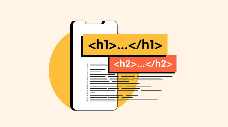
Another common mistake: using header tags (H1, H2, H3) to make text bigger instead of marking structural hierarchy. If you want emphasis or a larger font size, use CSS styling or semantic emphasis tags like strong or em. Reserve headers for the actual page structure. This helps both search engines understand your content organization and screen readers navigate your page logically.
The fastest way to audit your own site: try navigating it without a mouse. Use only the Tab key. Can you reach every link? Can you tell where you are on the page? Can you use the menu? Does the site have a skip link at the top? If you can’t complete basic tasks with the keyboard alone, your site is failing accessibility—and probably frustrating plenty of sighted users too.
Then turn off animations in your browser settings and reload the page. Does critical functionality break? Do things become invisible? If your site requires animations to work, you’ve made aesthetics mandatory instead of optional.
Finally, ask someone unfamiliar with your site to find three pieces of information: a product spec, a contact method, and pricing. Time how long it takes. If they’re clicking through multiple menus or struggling to locate basic information, your “clean” design is just hiding things.
Good design doesn’t sacrifice function for form. It makes both work together. Your site should be beautiful and usable, striking and navigable, modern and accessible. Those aren’t competing goals. They’re the same goal.
When your site looks incredible but loses customers because they can’t use the menu, you don’t have good design. You have expensive decorations.
Sources:
- Florida International University: “How to Add Emphasis to Your Text with Accessibility in Mind” – https://core.fiu.edu/blog/2024/how-to-add-emphasis-to-your-text-with-accessibility-in-mind.html
- WebAIM: “The WebAIM Million – 2025 Report” – https://webaim.org/projects/million/
- WebAIM: “Screen Reader User Survey #10” (2024) – https://webaim.org/projects/screenreadersurvey10/
- Awwwards: “Evaluation System” – https://www.awwwards.com/about-evaluation/
- Greenspector: “Analysis of the 10 sites nominated for mobile excellence by Awwwards” – https://greenspector.com/en/analysis_sites_nominated_mobile_excellence_awwwards/
- Trost Codes: “Accessible Awwwards” – https://trost.codes/posts/accessible-awwwards/